Tuesday, 21 April 2009
Monday, 20 April 2009
Sunday, 19 April 2009
Saturday, 18 April 2009
question 1 part 4
Friday, 17 April 2009
question 1 part 5
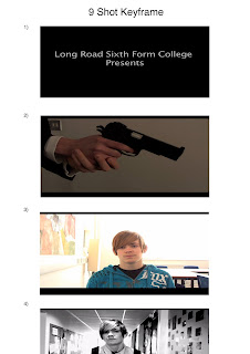
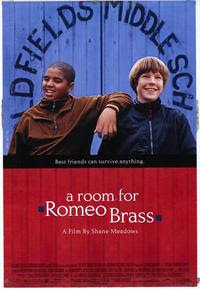
There weren't many visual effects in my opening sequence, so I chose the way it cuts between the titles, and the main character walking down the corridor. I like the effect, and I think it makes the feel of the film seem more fast paced, which i was hoping for it to do. A film that I took this from is A Room For Romeo Brass which uses the same effect
Thursday, 16 April 2009
question 1 part 6
Wednesday, 15 April 2009
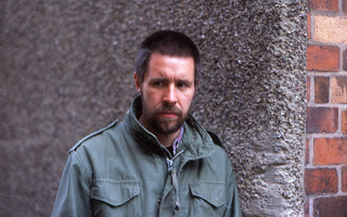
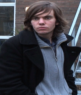
How does your media product represent particular social groups?
Tuesday, 14 April 2009
What kind of media institution might distribute your media project and why? How did you attract / address your audience?
Monday, 13 April 2009
Who would be the audience for your media project?
They said that because of my main titles being in black and white, they thought that maybe the rest of the sequence could maybe be in black and white
They also said that I didn't need the conversation at the end as it starting the story, and isn't really relevant to the opening sequence.
I have taken this feedback into consideration
Sunday, 12 April 2009
question 4 part 2
Saturday, 11 April 2009
Friday, 10 April 2009
Thursday, 9 April 2009
Wednesday, 8 April 2009
Looking back at the preliminary task (the continuity editing task), what do you feel you have learnt in the progression from it to full product?
Wednesday, 4 March 2009
Invoice Audit
- Making that sure that I have all the props/costumes ready for filming in advance instead of leaving it to the last minute
- Using a minimal cast, so if one person doesn't turn up for filming, it won't be so bad
- Maybe use a different variety of shots, such as long distance shots, instead of using so many close-ups
Three people that I did not work with at all on the project are James, Philippa and Joe. With the next project, I could get them to help with the camerawork instead of using the people that I always work with
Monday, 2 March 2009
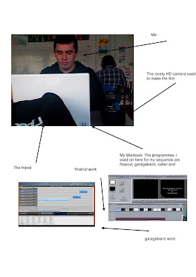
Screengrabs
Sunday, 1 March 2009
Evaluation Questions/ Answers
I have stuck to most forms of conventions for my opening sequence. I have introduced a few of the key characters and have not given away too many plot details that would ruin the rest of the film. Also, my opening sequence has stuck to the way that most action films open, and that is by starting with action before getting into the story. The titles may seem bland, and the name of the film isn't written in a way that most titles are written.
2) How does your media product represent particular social groups?
My sequence doesn't really represent a social group. The characters in it don't really come from different social backgrounds or groups. It is mainly their views and opinions that are different, like a story of good vs evil.
3) What kind of media institution might distribute your media product and why?
The main distributor for my film would have to be one of the major companies as the film would be big-budgeted and a small studio wouldn't be able to afford the budget.
4) Who would be the audience for your media product?
I would say that the main target audience would be teenagers from 13 years old to about 25 years old. If i was making the whole film, I would include more things that would attract more of a different audience, like attracting girls to see the film instead of just guys.
5) How did you attract/address your audience?
With my opening sequence, I tried to start it with an intense scene, the interrogation of the main character, which involved a gun being pulled on him. I also worked on a soundtrack that made the scene more effective. I also wanted there to be a sense of mystery where people are questioning what's going on. Obviously, the questions would be answered during the course of the film.
6) What have you learnt about technologies from the process of constructing this product?
I'm not sure what the question means.
7) Looking back at your preliminary task (the continuity editing task), what do you feel you have learnt in the progression from it to full product?
I feel that I have learnt a lot during the making of this. I have grown more confident editing on finalcut. I also got a chance to try out with some of the camerawork, and tracking shots, so i feel that i have learnt a lot from the technical point of view. I have also learnt how to manage working with a cast and doing other things while I am waiting for my cast to become free.
Friday, 27 February 2009
Tonight Or Never - Final Version
Feedback From My Roughcut
- Editing - nice cuts between the gun, maybe don't use a fade
- when he's walking down the corridor, the shots are quite smooth and cut well.
- Good shots
- Well edited
- Looks good
- Lots of quick cuts could make it seem like a trailer
- Some scenes are too bright
- Good use of angles and shots
- Titles - I like that the titles are very simple, just plain white text on a black background.
- Also, i like that it shows a shot & then a title & then another shot opposed to title on shot because having the title on the shot could take away some attention from the shot
- All titles are way too fast
- Editing - The shots just need touching up as they are too bright
- Just a simple contrast change will do ( to make it darker)
- Other than that very good
- Titles - Work very well, some of the ones with more text are too short
- Good use of shots and this would benefit from the dialogue, but the shots establish the characters very well
- Name mentioned too much in the titles
- Good start with the gun
- Sound - Add dialogue andn some slow paced soundtrack to go under voice over
- Editing - Nice transitions & use of effects
- Titles between shots is good, lots of exposure, at times this worked, others it didn't
- Offtopic - Try and motivate your actor in the chair more. Needs realism
I have taken all of this feedback into account and have made the changes accordingly.
Thursday, 26 February 2009
Second Rough Cut
Wednesday, 25 February 2009
Tonight or Never - Rough Cut
Tuesday, 24 February 2009
Filming Part 2
Editing Day 1
The only things i need to do now are get a sound effect of someone getting punched in the face, edit the final part of the sequence, record the main character's voice-over and then finish the rest of the soundtrack. It should take the next couple of days to get everything finished.
A Real Sense of Achievement
Tips For Myself With Future Filming
2) Film in a location with plenty of space
3) Check that the sound is recording and the lighting of the set
4) Learn how to transfer the footage properly
5) Make sure that the locations are found before filming
6) Use a variety of different camera techniques
7) Find alternative filming locations in case one doesn't work out
8) Be ambitious
9) Don't trust your friends with acting schedules
Okay, these aren't all mine. I took some of other people's ideas, but i still think that they are important.
Filming Part 1
Anyway, i started filming with the help of Matt L, Kirk and Tom Anderson, who was apppearing as my lead character. We found a room that could be used for a possible interrogation, and created room to film, as the room we were in wasn't very big. We did a couple of rehearsal scenes, and then filmed. We managed to get through it all quite quickly.
After we were finished in the room, Kirk and Matt went off to work on their own sequences, and Dave took over. We filmed the corridor scene, and that was done well. We used a different variety of shot types. But we didn't manage to get it all finished in time.
Wednesday, 11 February 2009
My New Continuity Task
This is the continuity task that I appeared in.
Tuesday, 10 February 2009
Information About Filming
Sunday, 8 February 2009
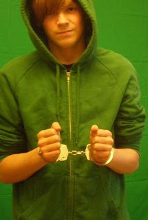
Tonight Or Never Cast


Wednesday, 4 February 2009
Major Issues
Prpblems Likely To Occur Whilst Filming
Tuesday, 3 February 2009
Different Film Opening Sequences
1) Quantum of Solace
I like the way they mix the animation in with the live action.
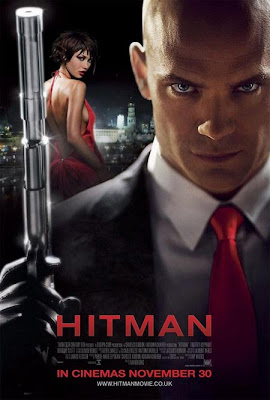
2) Hitman
Filming Times
Location Hunting
Location 1 - a room. This can easily be found, possibly by using one of the classrooms in College.
Location 2 - a school corridor. The main character walks down a corridor whilst the titles are appearing in the sequence.
Location 3 - outside the front of school/college - this is where the main character's friend meets up with the secret agent to talk about the main character.
Location shots will be added ASASP!!!!
Costumes
Also, the opening sequence features the main character when he has been captured by the assassin. For that part, he will be wearing casual clothes. You know, the sort of clothes you'd expect to find on a teenager.
The Secret Agent - for the sequence, it has him meeting up with the friend at the school. For him to blend in with the crowds, he will be wearing casual clothes. That means, he'd be dressed up as a normal person you'd see in the streets, not to attract any attention to himself.
The Assassin - as his part in the sequence is set towards near the end of the film, he shall also be wearing casual clothes. As this part is set in a room, he will just be wearing casual clothes.
Cast Photos with the characters wearing their costumes, will be added once it comes to the proper filming stage.
Prop List
2) A chair
3) An iPod
4) Fake Blood - for the opening injuries
5) Rope - lots of it
6) Rucksack 1
7) Rucksack 2
This list will be altered if any more props are needed. But for the time being, they're all i need.
Friday, 30 January 2009
My Animatic
3 Frame Sequence
Thursday, 29 January 2009
Shot Types
2) An over the shoulder shot of the main character getting punched in the face by the assassin
3) A close-up of the main character's face as the assassin talks to him
4) A reaction shot of the assassin's face when the main character refuses to help him
5) A close-up shot taking the gun out of his jacket
6) A mid-shot of the main character sitting on the seat
7) Freeze frame of the main character's face as the narration starts
8) A tracking shot of the main character's feet as he walks down the corridor
9) A mid-shot of the main character as he walks down the corridor (ends on start of neck)
10) A close-up of the main character's face as he walks down the corridor
11) A backward shot of the main character walking down the corridor
12) A pan down shot of him taking his iPod out of his pocket
13) A close-up shot of the iPod
14) A shot of the main character as he starts to walk down the stairs
15) A zoom in shot of the friend meeting the assassin outside
16) An over the shoulder shot of the friend saying about suspicions
17) An over the shoulder shot of the agent
18) Friend reaction shot of the agent's answer to the question
19) Close-up shot of the agent as he speaks to the friend
20) End of sequence
Wednesday, 28 January 2009
Tuesday, 27 January 2009
Main Plot Outline/ Timeline
2) The assassin questions the main character and when he refuses, he pulls out a gun and threatens to shoot him - 15 seconds
3) The screen freezes and the main character briefly narrates the story - 10 seconds
4) Titles appear as the main character walks down a corridor, wearing his school uniform, it cuts between the titles and the action - 50 seconds
5) Skip to the main character's friend talking outside the school with a secret agent guy - 25 seconds
6) End of Sequence
Monday, 26 January 2009
My Moodboard
Friday, 23 January 2009
Moviestorm Practice
Thursday, 22 January 2009
Film Brief 1 - My Chosen Idea
The Essential Elements For A Successful Opening Sequence For A Film
Wednesday, 21 January 2009
Shadowplay Studios
The thing that i instanly recognise about going on this website, is that the layout is very simple, it isn't very hard to navigate yourself around, which some websites are like, and its also the types of films that they actually create the opening sequences for. Both Juno and Thank You For Smoking are independantly produced movies, where the budget is not as significant as a blockbuster movie.
I've also noticed that the sequences for both of their movies, is that they like to include a lot of light colours in them. The sequence in Juno is very colorful, whereas the sequence for Thank You For Smoking, is bright colours, such as red or yellow. For all of their other work as well, there never really seems to be a lot of dark colours, they are quite bright.
Stormbreaker Opening Sequence
Titles
Sarah Bolger
Robbie Coltrane
Stephen Fry
Damian Lewis
Ewan McGregor
Bill Nighy
Sophie Okonedo
Alex Pettyfer
Missi Pyle
Andy Serkis
Alicia Silverstone
Ashley Walters
and Mickey Rourke
Additional Martial Arts Sequences - Donnie Yen
Casting Director - Sarah Bird
Costume Designer - John Bloomfield
Hair and Make-Up Designer - Kristin Chambers
Associate Producer - Jessica Parker
Line Producer - Kevan Van Thompson
Music Composed by Alan Parker
Editor - Andrew MacRitchie
Production Designer - Ricky Eyres
Director of Photography - Chris Seager ASC
Executive Producers - Hilary Dugdale, Nigel Creen, Anthony Horowitz, Andreas Schmid
Screenplay by Anthony Horowitz - based on his novel
Produced by Marc Samuelson, Peter Samuelson, Steve Christian, Andreas Crosch
Directed by Geoffrey Sax
I like the way this sequence is done. It opens the film really well. The way the sequence opens with Alex Rider doing a class presentation about his family life, and saying that his uncle has a really boring job. It then cuts to a shot of Ian Rider escaping on a motorbike and being chased after by the villains. This is a class opening type for a secret agent film because it opens with an action scene, before it gets onto its main titles. This is an example of a film opening i shall be looking at for inspiration as i film my opening sequence.
Comic Book Openings
The main reason why i chose this opening sequence was because of the fact that this was one of the only comic book adaptions, which have some titles at the start of the movie. The eery music helps to create tension with the knowledge that something bad is going to happen.
My Chosen Idea
Tuesday, 20 January 2009
My Logo
Monday, 19 January 2009
My Pitch Feedback
Sunday, 18 January 2009
Film Brief 1
A person gets the shock of their life when they get recruited into the British Secret Sevice.
More Detail
This would feature lots of impressive gun fights, car chases and brawls. Unfortunately due to budget restrainsts, we won't be able to film them, so there's no need of explaining it. :)
Film Brief 4
A story about a man learning to cope with the death of his wife and the psychological breakdown he suffers because of it.
Full Plot
A man's wife went missing and supposedly died six years ago. He spends each night stalking the streets where her body was found. One day, he spots a woman who happens to look like his wife, and he follows her. Everything is not as it seems. You get the point.
Films This Could Be Compared To
1) Tell No One
Film Brief 3
A coming of age tale about a teenager who runs away from home in search of following his dreams, but things don't go according to plan.
Full Storyline
Life has it in for teenager Archie. At seventeen, he is unable to achieve what he wants in life. When a job interview goes wrong, his College day goes even worse, and his home life isn't even better, he decides to run away in pursuit of his dreams. He finds a place and he manages to get himself a job to sustain himself. Along the way, he encounters a whole host of characters, including the headphone kid, who teach him that following your dreams doesn't mean everything... something like that.
Films That This Could Be Compared To
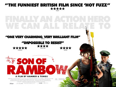
1) Son of Rambow - the story of friendship
2) Flashbacks Of A Fool - the main character running away from home to do what he wants to do.
3) August Rush
4) Oliver Twist
And anything else that might be good.
Friday, 16 January 2009
Angus, Thongs And Perfect Snogging Opening Sequence
This is my research for Film Option 3, where the main protagonist is a teenager.
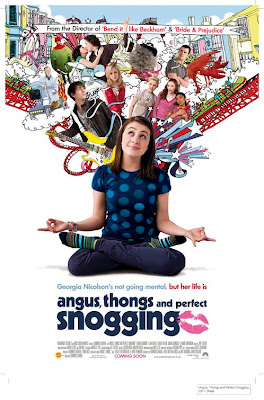
I like the way this sequence opens, throwing the audience straight into a situation. It has Georgia being followed by her dad in the car on her way to a party. She is coming as a stuffed olive. Once at the party, it has her being the only one who is dressed in a comical outfit, and she is laughed at by another girl, who is a bully. This straight away lets the audience know that Georgia is sometimes a victim of bullying.
Georgia confronts some of her friends, and in anger, she leaves the house. The opening credits then start to appear on the screen as Georgia runs home. The song is quite upbeat and the lyrics are about a girl and how lovely she is. It is a reference to Georgia's character as well. The titles also come up in girl style, with curves at the start and end of letters, and also, the i's also have bubbles on the top of them. This is the reason why i like the sequence.
Thursday, 15 January 2009
Hurtwood House Opening Sequence
I chose to look at Marauders from Hurtwood House. I think the sequence is nicely done, with the different coloured backgrounds and the silhouetted figures coming across the screen. It shows that the film is going to be a heist movie because it has people stealing stuff. I found the music interesting at first, but by the end of the sequence, it started to get on my nerves. But it worked well for the type of sequence that they were going for. It seems like a good opening sequence and it would make me want to carry on watching the film because it has a sense of mystery about it, and you don't know who any of the characters are.
Thriller Opening Analysis
For the construction of the video, i would give it a total of 45 marks out of 60. The titles were well done. The only thing i didn't understand with the titles was the name of the film itself, but once i read through the blog, i understood that the film was called 3nigma. The soundtrack was good, it kept my attention thoughout.
The sequence also did well to build up the suspense. It made me want to carry on watching the rest of the film as well. What also worked well is that you weren't sure what to expect. One minute, it seemed like a torture flick, but the next, it seemed to be something completely different. It has a good sense of mystery about it.
There were only a few things that i found, which weren't really up to scratch. The scenes seemed quite jumpy, the camerawork was also shaky. I'm not sure if that's what they intended because there was no indication of it in their planning. I also felt that there was no sense of characters in this. You aren't sure who the characters are. Also, the name of the film was introduced at the end of the sequence, not at the middle, which meant that it looked more like a trailer or a flashback sequence than what it did as a film opening sequence.
For the research and planning on the blog, i would give them 10 out of 20. There were only a few posts on the blog, and for a group of 3 or 4 members, that isn't a significant amount of blog posts. I felt that the planning for the sequence was good, explaining everything that they wanted to achieve. It featured the title design and prop list. But it could've gone into further details, like step by step planning of what they were hoping to achieve.
There was also no research to go with the planning. There was a blog post defining a thriller and all of the different types of conventions you get with a thriller, but that was it. There was no analysis of any other film openings, which should've been there. But i do like the way they explained how they chose the title for the sequence.
Wednesday, 14 January 2009
Tuesday, 13 January 2009
Columbia Pictures Logo
Right. Okay. I'm not exactly sure how the bigheads at Columbia Pictures made this logo, but i'm gonna take a guess that the first thing they had sorted was the background shot of the sky. They then probably had the woman carrying the torch. They would've done some sort of animation to make the clouds move in the background.
They would've then added the fade in to the opening of the sequence, and have it zooming out from the woman's face. They would've then made sure that they would've had the company's titles created, and it fades on over the top of the woman. The soundtrack would also be created and added in at the end of the clip.
There you have it. That's how i would go about trying to re-create the sequence. I'd be surprised if i actually got it right....
Monday, 12 January 2009
Casino Royale Opening Sequence Continued
Michael G Wilson, one of the producers of the Bond series, has been producing the films since Live And Let Die, which was made in 1973. Since then, he has produced every single Bond film. He has also written the screenplays for a number of the Bond films, including For Your Eyes Only, Octopussy, A View To A Kill, The Living Daylights and Licence to Kill. He also appeared in the Bond series, even though they have largely been cameo roles. He was born in 1943 in New York City.
Barbara Broccoli is also another one of the film's producers. She is the daughter of Albert R Broccoli. She started to produce the Bond series with The Living Daylights, which was made in
1987.
The opening titles for the sequence was designed by Daniel Kleinman. He first started designing the opening titles since Goldeneye, which was made in 1995. He has designed the title sequences for the Bond films ever since then.
Continuity Task
Sunday, 11 January 2009
Casino Royale Opening Sequence
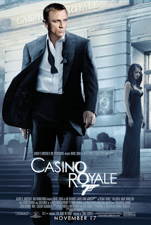
I like the way the sequence opens with a black and white shot of James Bond picking up his gun. As he shoots, the blood comes down, the theme song starts playing and the colour of the film begins. The titles are nicely done, coming up across the screen. In the background, it has the various different shots of faded out James Bond, as he subdues some villains. The different shots of cards let the audience know what the story of the film is going to be about.
The song "You Know My Name" by Chris Cornell, plays the whole time. It is a fast-paced song, which also shows the fact that the film will be quite fast paced and action packed. The sequence also shows James Bond's elevation to Double O standards. It is not important to show happen in a proper scene, so it is shown via the credits.
The sequence shows James Bond as shaded and we never really see his proper face in the sequence until right at the end, which shows he is a mysterious character. The editing is done in quick cuts, where each scene only goes on for a few seconds.
The title sequence is animated, but you get to see the face of Eva Green, who plays Vesper Lynd, and Daniel Craig, who plays James Bond. Overall, this is a very good title sequence, which keeps the viewer's attention for the duration of it.


